Enhancing Event Management With a User-Centric Platform
The Overview:
In today's fast-paced digital landscape, event organisers require seamless, intuitive, and efficient platforms to manage events effortlessly. This project was initiated to create a modern event management system tailored to streamline the event planning process. The platform was designed to empower users with an easy-to-navigate interface, robust event customisation options, and a structured onboarding experience that minimises cognitive load.
The Scope:
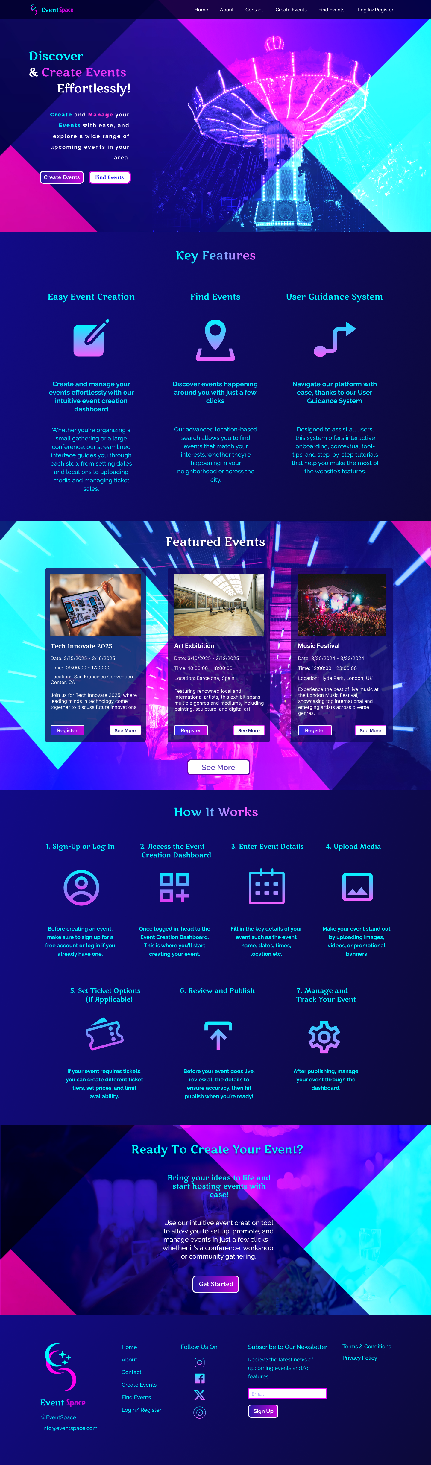
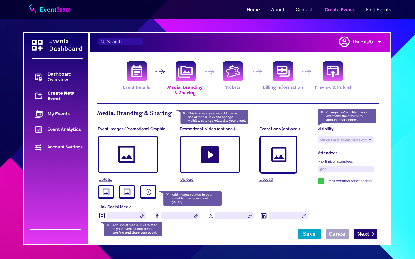
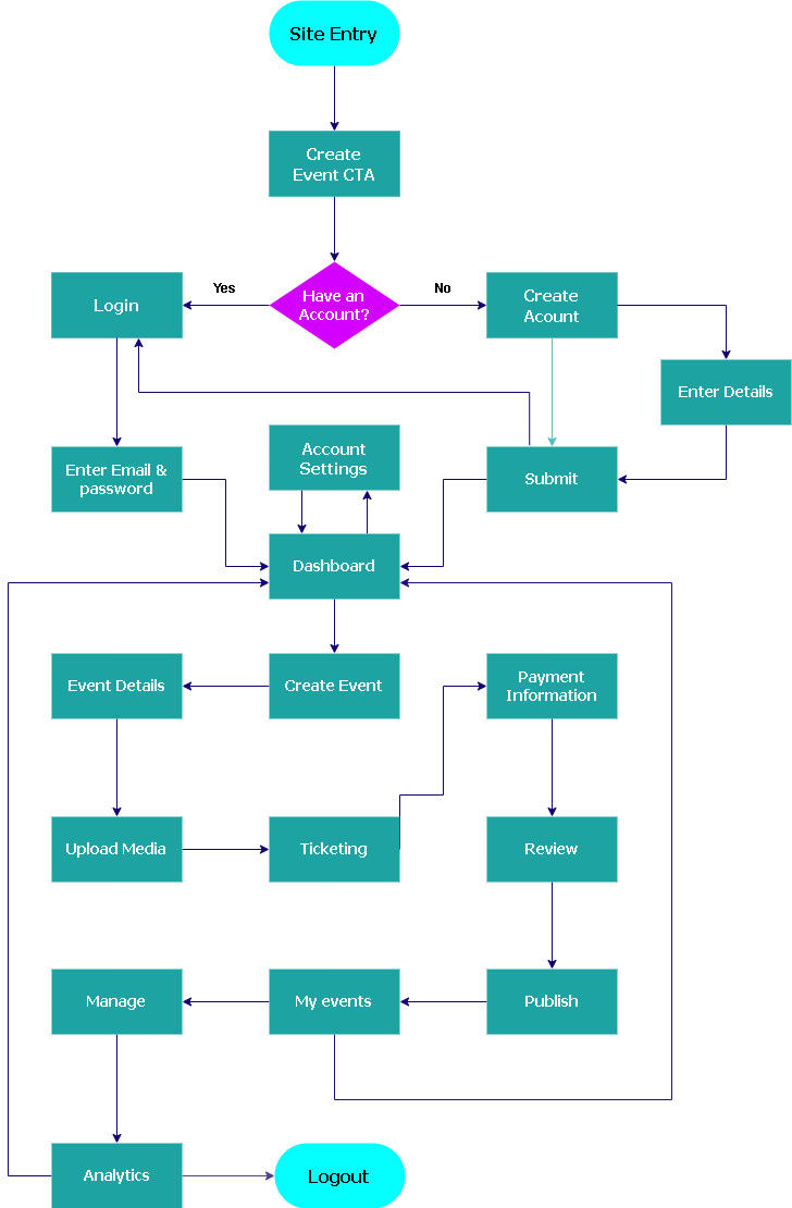
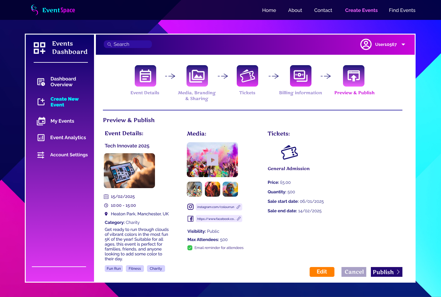
The primary goal of this project was to develop a fully functional web-based event management system that enhances usability through an intuitive design and user guidance system. The platform includes essential features such as event creation, ticketing, media branding, and analytics while incorporating user onboarding elements like contextual tooltips and step-by-step guidance. By integrating best practices in UI/UX, the system ensures that users, regardless of technical expertise, can effectively navigate the platform with ease.
A key focus of this project was reducing the learning curve for new users by leveraging structured assistance. This approach improves user engagement, boosts task efficiency, and enhances the overall user experience. The platform was built with scalability in mind, ensuring flexibility for future enhancements and integrations.
The Tools of the Trade:
To bring this project to life, a combination of modern development and design tools was utilised:
- Figma – Used for wireframing and designing a user-friendly interface with a strong emphasis on usability and aesthetics.
- React.js – The core framework for building a dynamic and responsive front-end experience.
- Tailwind CSS – Employed for styling, ensuring a sleek and consistent design with efficient, utility-first CSS.
- HTML & JavaScript – Used to structure and enhance the platform's interactivity.
Addressing Usability Challenges:
Managing events efficiently requires a digital platform that is both intuitive and feature-rich. However, many existing event management systems present usability challenges, making it difficult for organizers to navigate complex functionalities without prior technical experience. The lack of structured onboarding, clear guidance, and intuitive design often results in frustration, increased learning curves, and inefficient workflows. Recognizing these pain points, the project aimed to develop a user-centric event management system that simplifies event creation, ticketing, and attendee engagement through a more intuitive and guided experience.
The Main Audience:
The platform is designed for event organizers, businesses, and individuals who need a streamlined solution for managing events of various scales. These users often struggle with onboarding, feature discovery, and efficient navigation, leading to missed opportunities and lower engagement. The system aims to address the needs of both experienced event planners and first-time users by offering a structured user guidance system, making the platform accessible to all skill levels.
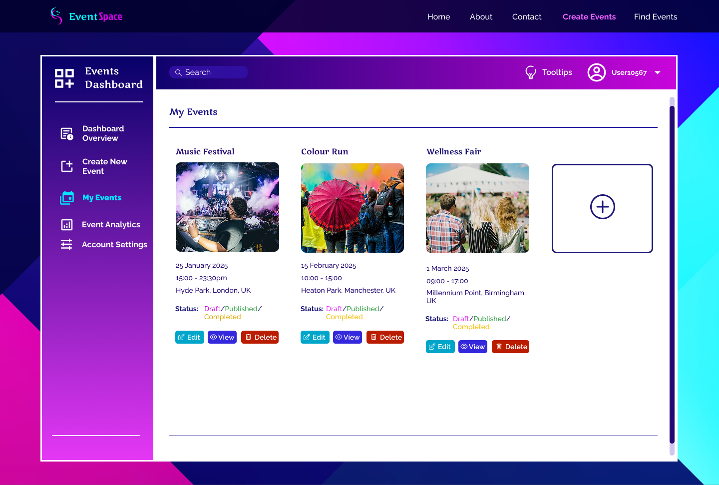
A Useful Guidance System:
A structured onboarding system with contextual tooltips and guided walkthroughs was implemented, thus reducing cognitive load, improving feature discoverability, and creating a more engaging user experience. Additionally, the project focused on optimizing workflow efficiency, increasing user retention, and ensuring seamless event setup and management. By prioritizing intuitive design and user assistance, the platform empowers organizers to execute events with minimal friction and maximum efficiency.
The Research Process:
To ensure an intuitive and efficient event management system, a heuristic evaluation was conducted as the primary research method. This evaluation involved systematically assessing the platform’s interface against established usability principles, such as Jakob Nielsen’s heuristics. The research focused on identifying usability issues related to navigation, feature discoverability, and user guidance. The evaluation was carried out by analyzing the platform’s structure, workflows, and interactive elements to pinpoint areas that could cause friction or cognitive overload for users.
Discussing Pain Points:
The heuristic evaluation revealed several critical pain points and opportunities for improvement:
- Lack of Clear Onboarding – Users struggled to understand key features due to the absence of structured guidance when first interacting with the platform.
- High Cognitive Load – Complex workflows and multiple features overwhelmed users, making it difficult to complete event setup efficiently.
- Low Feature Discoverability – Essential functionalities, such as ticketing and attendee management, were not easily accessible, leading to underutilization.
- Navigation Inconsistencies – Users found the interface challenging to navigate due to unclear labelling and unintuitive menu structures.
- Need for Contextual Assistance – The absence of in-app tooltips and guidance systems made it harder for users to learn and adapt to the system quickly.
Based on these findings, it became clear that certain features needed to be implemented:
- An interactive onboarding system to guide users through essential workflows.
- Contextual tooltips and help prompts to enhance feature discoverability.
- A simplified and structured navigation to reduce cognitive overload and improve efficiency.
- Progressive disclosure techniques to present features as needed, avoiding unnecessary complexity.
The Design:
The visual design of the event management platform was carefully crafted to provide a modern, engaging, and user-friendly experience. The design decisions were guided by principles of clarity, accessibility, and aesthetic appeal, ensuring that users could navigate the system effortlessly while enjoying a visually cohesive interface.
Color Scheme: A Balance of Energy and Professionalism
The platform's colour palette was selected to create an inviting and dynamic user experience. The combination of purple, pink, dark blue, and cyan serves multiple purposes:
- Purple conveys creativity and innovation, aligning with the theme of event planning.
- Pink adds a sense of excitement and vibrancy, making the interface feel lively.
- Dark blue establishes a professional and trustworthy atmosphere.
- Cyan enhances contrast and readability, ensuring clarity in user interactions.
By incorporating gradients and a balanced mix of these colours ensured that the interface remained visually engaging while maintaining a professional and structured look.
Typography: Enhancing Readability and Brand Identity
The chosen fonts, Marko One and Raleway, were selected for their distinct characteristics:
- Marko One - Used for headers and key interface elements, providing a bold, authoritative feel that draws attention.
- Raleway - Applied to body text and descriptions, offers a clean, modern, and highly readable experience.
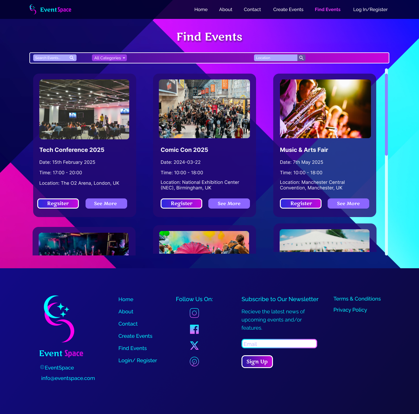
Iconography: Simplifying Navigation
A consistent set of icons was used to reinforce key actions and guide users intuitively. The iconography follows an angular and minimalist style, ensuring clarity without unnecessary embellishment. The goal was to reduce cognitive load by providing familiar, easily recognizable symbols that help users quickly locate functions such as event creation, ticket management, and analytics.
Overall Aesthetic: Angular, Modern, and Functional
The interface follows an angular design style, characterized by sharp edges and geometric elements. This approach was chosen to:
- Give the platform a sleek and professional appearance.
- Maintain consistency across different UI components.
- Enhance usability by using well-defined sections and structured layouts.
The combination of these design choices ensures a platform that is both visually appealing and functionally effective, ultimately leading to a better user experience.
The development of this event management platform demonstrates how thoughtful design, user-centred research, and modern technology can create a streamlined and intuitive experience. By addressing usability challenges through structured onboarding, contextual tooltips, and an optimized user interface, the platform ensures that event organizers can navigate complex functionalities with ease.
Through the integration of Figma for UI/UX design, React.js for dynamic functionality, Tailwind CSS for responsive styling, and HTML for structural integrity, the project successfully delivered a visually engaging and highly functional event management solution.
By focusing on reducing cognitive load and improving user guidance, the platform not only streamlines event creation and management but also enhances overall user satisfaction. This case study highlights the importance of combining research-driven insights with strategic design choices to build a product that is both visually compelling and functionally robust.
As event management technology continues to evolve, the principles and methodologies applied in this project serve as a foundation for further enhancements. Future improvements could explore AI-driven automation, deeper personalization, and expanded accessibility features to refine the user experience even further.
Ultimately, this project showcases how a user-guided system with onboarding and contextual support can transform complex event management tasks into a streamlined, efficient, and enjoyable process.